Landing pages: A first step towards venture validation
New product, whether as part of a new venture or a corporate project is often built on a foundation of blind faith. Landing pages can be an initial antidote - but how should you interpret the results?

I am slightly enamoured with landing pages - to the point that my colleagues think I may have a problem.
My reasoning is sound though. New product, whether as part of a new venture or a corporate project is often built on a foundation of blind faith.
The genesis of such ideas is frequently the entrepreneur or the HIPPO’s (highest paid person’s) fertile imagination. Those ideas are gradually nurtured over board room conversations or late night, back of the envelope drinking sessions until they gain a life of their own - a solidity which they have not earned.
Beyond proper user interviews, landing pages are often the antidote as they represent a first opportunity to expose our ideas to hard data.
In this post, I look at what a landing page is, how we drive traffic to it and importantly how you should interpret the results (with a downloadable Excel template to help you).
NB. The last thing I want to do is quash an imaginative brain storming process. The important thing is that proper validation comes next. Through hard won experience I know that a failure to perform early validation can lead to huge amounts of wasted investment - don’t be me, don’t waste years chasing things that were unlikely to convert.
What are they and why are they cool?
In the ambiguous world of new products and ventures your biggest risk is investing too much time in a dead end. 90% of new ventures fail (and from my experience I’m not convinced the success rate for internal corporate products is much better) - the implication being that the vast majority run out of runway before they find a product that works.
Enter stage right: landing pages. The first reasonable, quantifiable experiment you can run to demonstrate your idea has some validity.
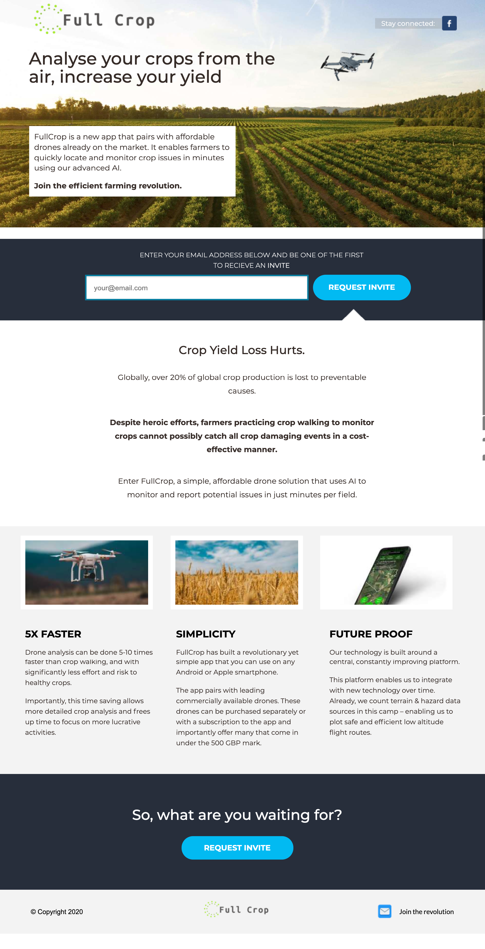
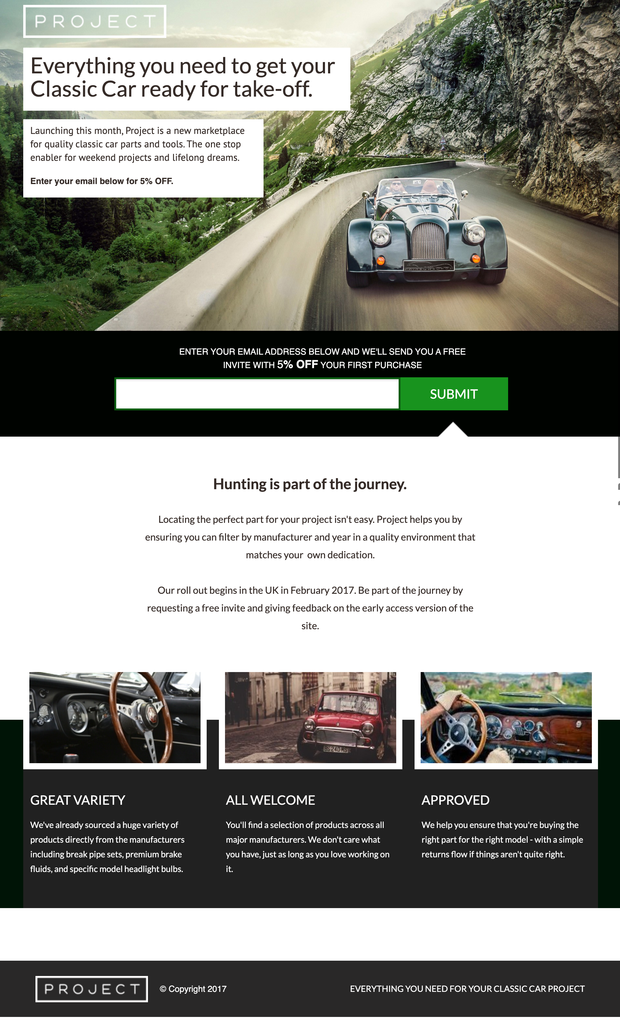
In its simplest form a landing page is a static web page containing your key headlines and differentiators. If a member of your target segment lands on the page, they should read the information and feel compelled to leave their email address.
Here’s a couple of examples from my own collection:


How to drive traffic to landing pages
There are whole load of platforms you can use to construct landing pages, Unbounce.com and Webflow being just a couple of examples.
For the most part, landing pages tend to be pretty simple, so a good rule of thumb is to not spend too much, and opt for a simple template that you can configure with your key messages without too much of a challenge.
Once it’s up and running, you can drive traffic to it from whichever source makes sense for your particular target segment. Facebook is a strong favourite of mine given their extensive targeting options and of course, for B2B ventures you could strongly consider LinkedIn (although you need to deal with the increased cost).
Further afield I’ve even had success with platforms like Taboola (for a travel sector startup) and Reddit (for anything with a special interest group attached to it). The key thing is to ensure that the people who see your ad are very likely to be in your defined target segment. You won’t get that match to 100%, but it’ll save you money on clicks and tighten your results so that you can use them properly in analysis.
So my landing page is running - what next? (With a downloadable results spreadsheet)
Interpreting the results is not quite as straightforward as you might imagine.
This is predominantly thanks to maths - the particular branch of maths that reminds us of the truly unstable and unpredictable nature of the world we live in (despite our human desire for it to be otherwise).
You can download a simple results Excel template here: Download
To use it, simply modify the top two numbers (visitors and conversions) from your analytics platform: (e.g. Google analytics) and the conversion count you’ve seen.
Look at the CI level tables: For example, with 100 visitors and 20 conversions if you continued until every member of the target segment had seen the page:
There is an 80% chance that the conversion number you would see is between 16.62% and 23.38%
There is a 99% chance that the conversion number you would see is between 10.70% and 29.30%
The key message on interpreting your results is that you can’t just take the average conversion rate and use that. Well, at least unless you’ve run hundreds of thousands of visits across the landing page which if you’re reading this, you probably haven’t.
At lower levels of visits that measure in the hundreds of views all you can say for certain is that the real average conversion rate is within a certain range. I can’t reiterate how important this is, if you don’t follow it properly, you’ll end up basing your future efforts on a falsity - which is only going to hurt you further down the road.
That said, you need surprisingly few visits (50-100) before you start getting to insight that I consider to be useful.
At these numbers you can make statements like: with 80% likelihood the real conversion rate for this landing page is between 20% and 40%.
That might seem like a pretty wide range and I can almost hear the screams of pain from data scientists decrying the use of an 80% confidence level - but let me try rephrasing it to demonstrate it’s power:
“For every five new ventures you pursue with this score, one will turn out to have a very different conversion rate (you might incorrectly pursue it) but four will at minimum have an excellent conversion rate”.
This is based on the fact that, for most ventures, getting 20% conversion (the low end of our confidence interval) would be really very good indeed - even after we’ve factored in that landing page sign ups do not equal full conversions.
Across the landing pages I’ve run, only about 3% have generated such a score.
Compared to blind faith, this insight is already very powerful. It doesn’t tell you whether the venture will be a success, but it does tell you that the odds show it’s worth further investment to find out.
Remember that a landing page is just the beginning
Let’s be clear. Landing page experiments such as this do not tell you whether your venture or product will be successful. What they do give you is some tool for surfacing and filtering good ideas.
That data you collect can be directly translated into your budget requests or pitch decks to give you some hard data to back up your story - without significant upfront investment. Even relatively non digital savvy teams can put one of these together in a matter of a week or two.
In my experience, investors, myself included, often struggle to find reasons to believe the story. Some hard data that correlates with your more qualitative research from user interviews can really help.
In a recent round of funding that I supported for a food delivery box startup this approach allowed us to close a seed funding funding round in just one week from five angel investors.
Instructively - not one of them asked us “why” we believed the venture was worth pursuing. Our use of landing page data made it a very easy decision for them.
And even if not for your investors or stakeholders - do you really want to spend the next years of your life working on something that can’t pass this confidence bar?